Taipei Metro App
Accessible, Integrated, and Improved Efficiency.
It’s a hackthon project for the Taipei Metro App, I work it with my friend at college. Its mission is to Integrate ride-experience with mobile payment functionality and optimise the user experience by revamping the information architecture.
Time Frame
June 2023
Role
UIUX Design
Involvement
UX, imformative structure
Mentor
None
Overview —
在搭乘台北捷運時,身為一般通勤族的我們對於 App 的需求其實不高;而在調查之後,發現 App 的價值在於服務特殊需求,像是身心障礙人士與運動愛好者等,想經由這次 App 的重新規劃,讓體驗優化的同時,服務到一般通勤族。
在搭乘台北捷運時,身為一般通勤族的我們對於 App 的需求其實不高;而在調查之後,發現 App 的價值在於服務特殊需求,像是身心障礙人士與運動愛好者等,想經由這次 App 的重新規劃,讓體驗優化的同時,服務到一般通勤族。
As commuters on the Taipei Metro, we don't have much need for apps. After researching, we found that the value of apps lies in serving special needs, such as physically and mentally challenged people, sports enthusiasts, and so on. Through this app replanning, we want to optimise the app experience and serve general commuters at the same time.With the popularity of mobile payment, the integration of physical and virtual services has become a trend. Therefore, I would like to take this opportunity to apply my knowledge of industrial design to design a metro app that better meets the needs of users.
As commuters on the Taipei Metro, we don't have much need for apps. After researching, we found that the value of apps lies in serving special needs, such as physically and mentally challenged people, sports enthusiasts, and so on. Through this app replanning, we want to optimise the app experience and serve general commuters at the same time.With the popularity of mobile payment, the integration of physical and virtual services has become a trend. Therefore, I would like to take this opportunity to apply my knowledge of industrial design to design a metro app that better meets the needs of users.
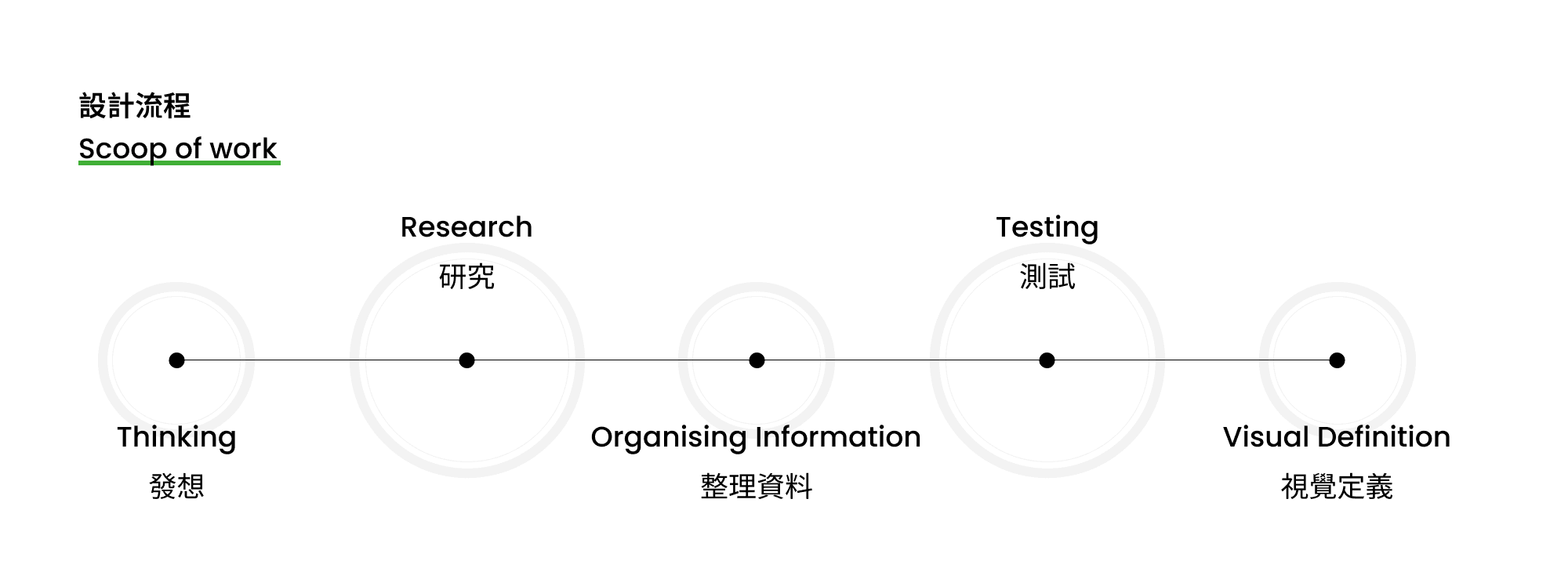
Design Process —
Goals —
重新排列資訊顯示層級
Rearrange the information display hierarchy把搭車相關/ 捷運關聯事業功能釐清
Clarify the functions of ride-related/
metro-related businesses整合悠遊付核心功能
Integrate EasyPay core functions
重新排列資訊顯示層級
Rearrange the information display hierarchy把搭車相關/ 捷運關聯事業功能釐清
Clarify the functions of ride-related/
metro-related businesses整合悠遊付核心功能
Integrate EasyPay core functions
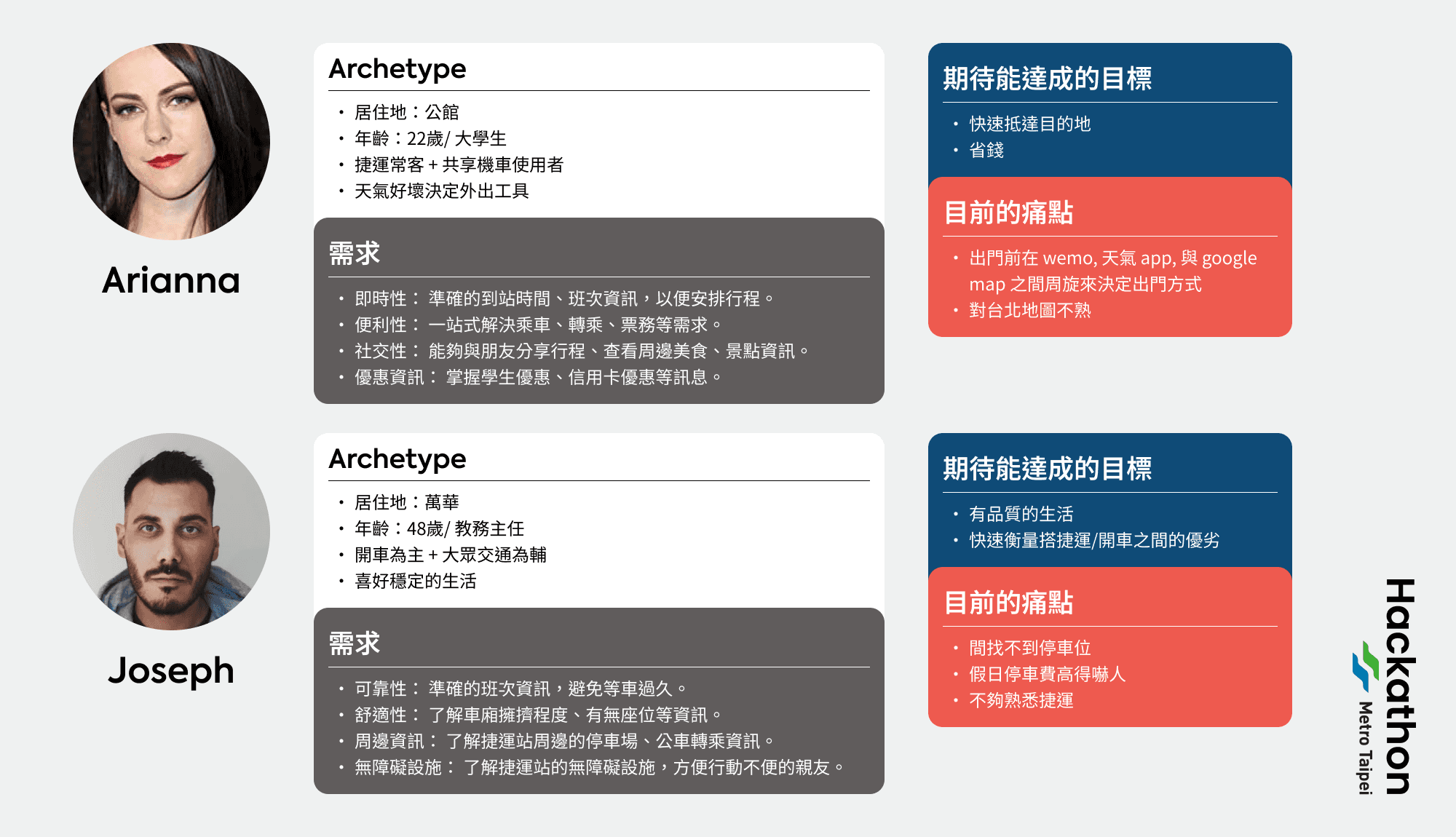
User Research —
Brainstormed User Flow —
Design System —
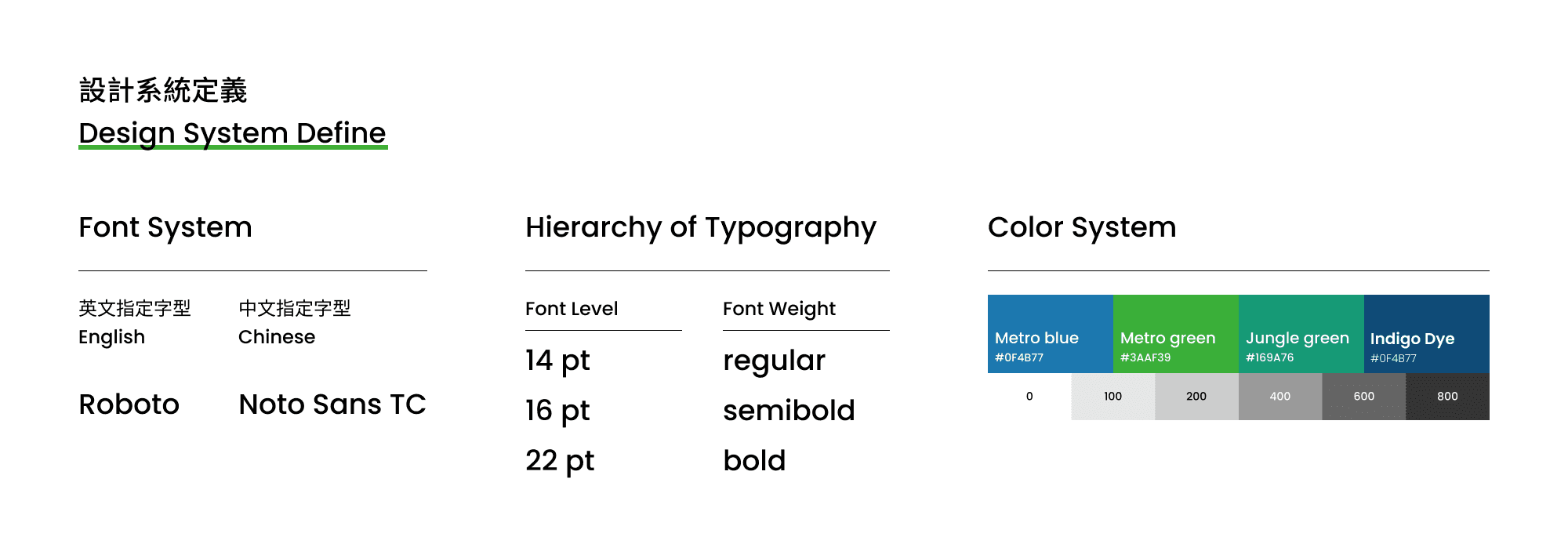
在設計系統上,力求簡潔清楚的視覺層級。考慮到 App 的使用年齡層廣泛,選擇特別為數位顯示優化過的 ”思源黑體” 與 ”Roboto”,並定義好每個層級的對應的字重 & 字級。色彩上除了應用台北捷運的品牌識別顏色之外,針對 UX 的閱讀體驗定義灰度的對比,提高體驗的通用性。
在設計系統上,力求簡潔清楚的視覺層級。考慮到 App 的使用年齡層廣泛,選擇特別為數位顯示優化過的 ”思源黑體” 與 ”Roboto”,並定義好每個層級的對應的字重 & 字級。色彩上除了應用台北捷運的品牌識別顏色之外,針對 UX 的閱讀體驗定義灰度的對比,提高體驗的通用性。
In terms of the design system, we aim for a simple and clear visual hierarchy. Considering the wide age range of app users, we chose ‘Siyuan Black’ and ‘Roboto’, which have been optimised for digital display, and defined the corresponding font weight and font level for each level. In terms of colours, apart from applying the brand identity colours of the Taipei Metro, we also defined the grey scale contrast for the UX reading experience to enhance the versatility of the experience.
In terms of the design system, we aim for a simple and clear visual hierarchy. Considering the wide age range of app users, we chose ‘Siyuan Black’ and ‘Roboto’, which have been optimised for digital display, and defined the corresponding font weight and font level for each level. In terms of colours, apart from applying the brand identity colours of the Taipei Metro, we also defined the grey scale contrast for the UX reading experience to enhance the versatility of the experience.
How App Solve Problem —
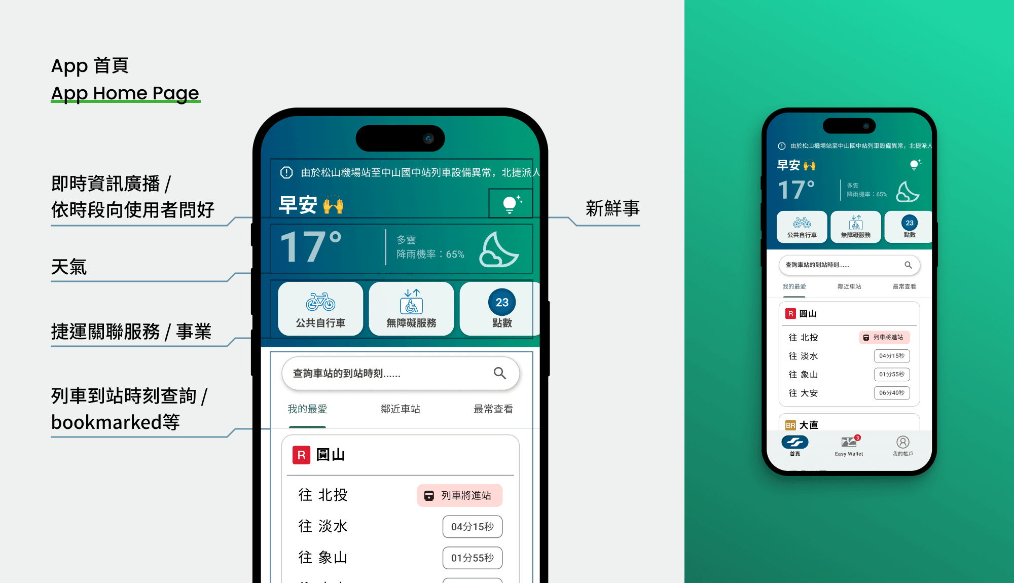
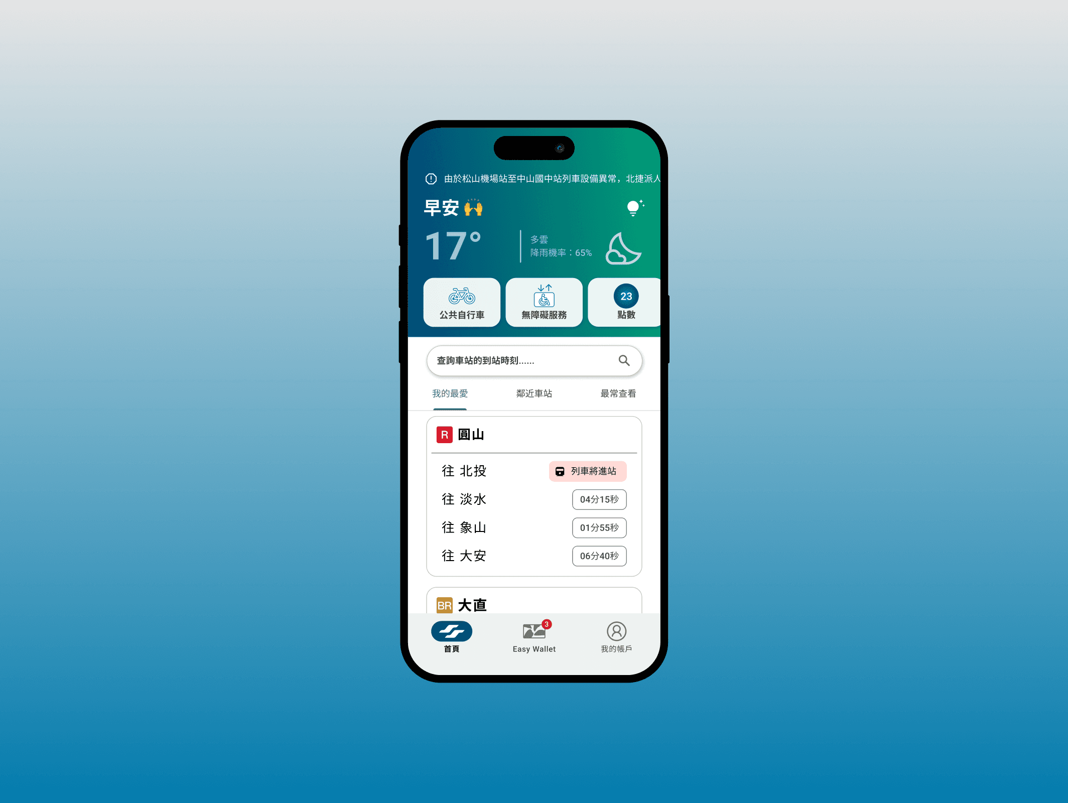
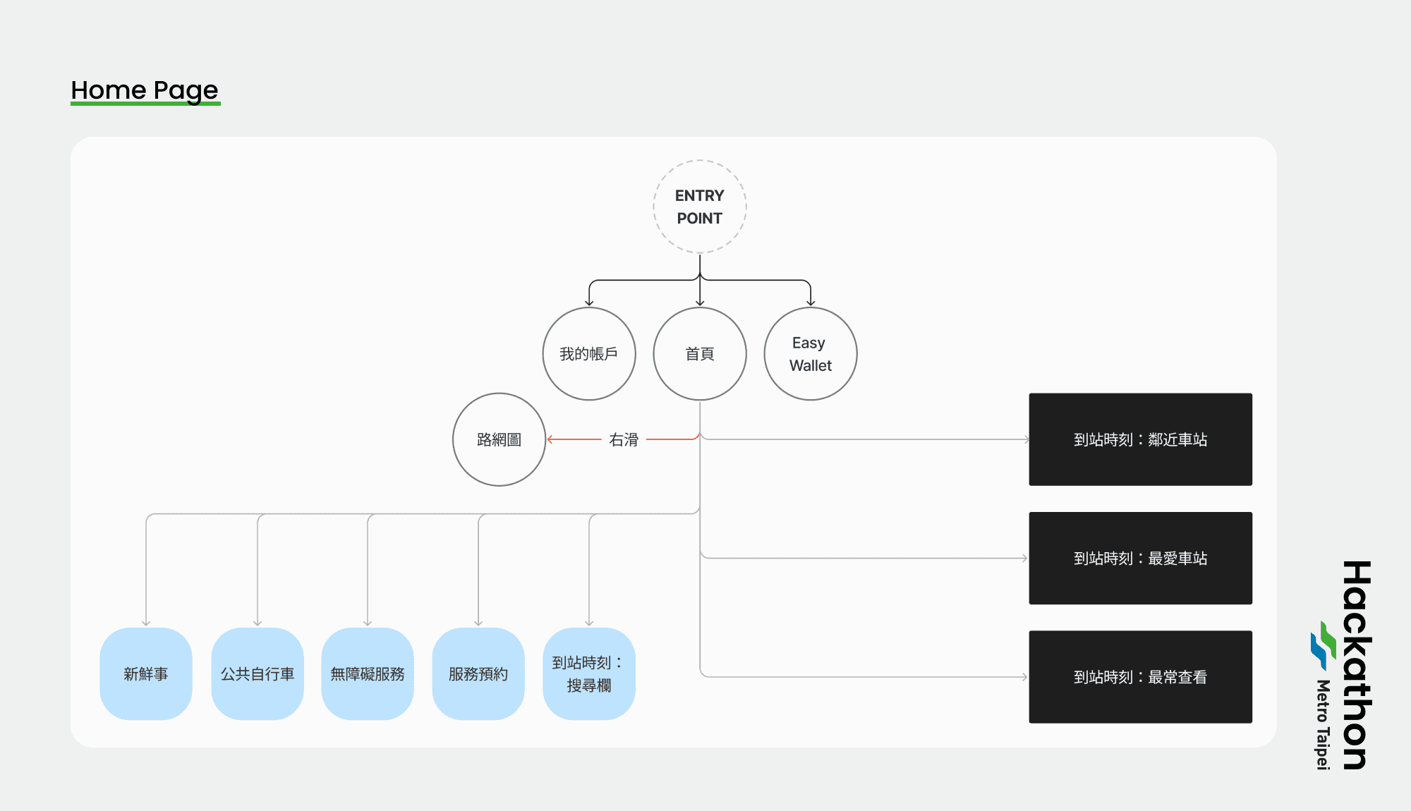
Home Page Refine
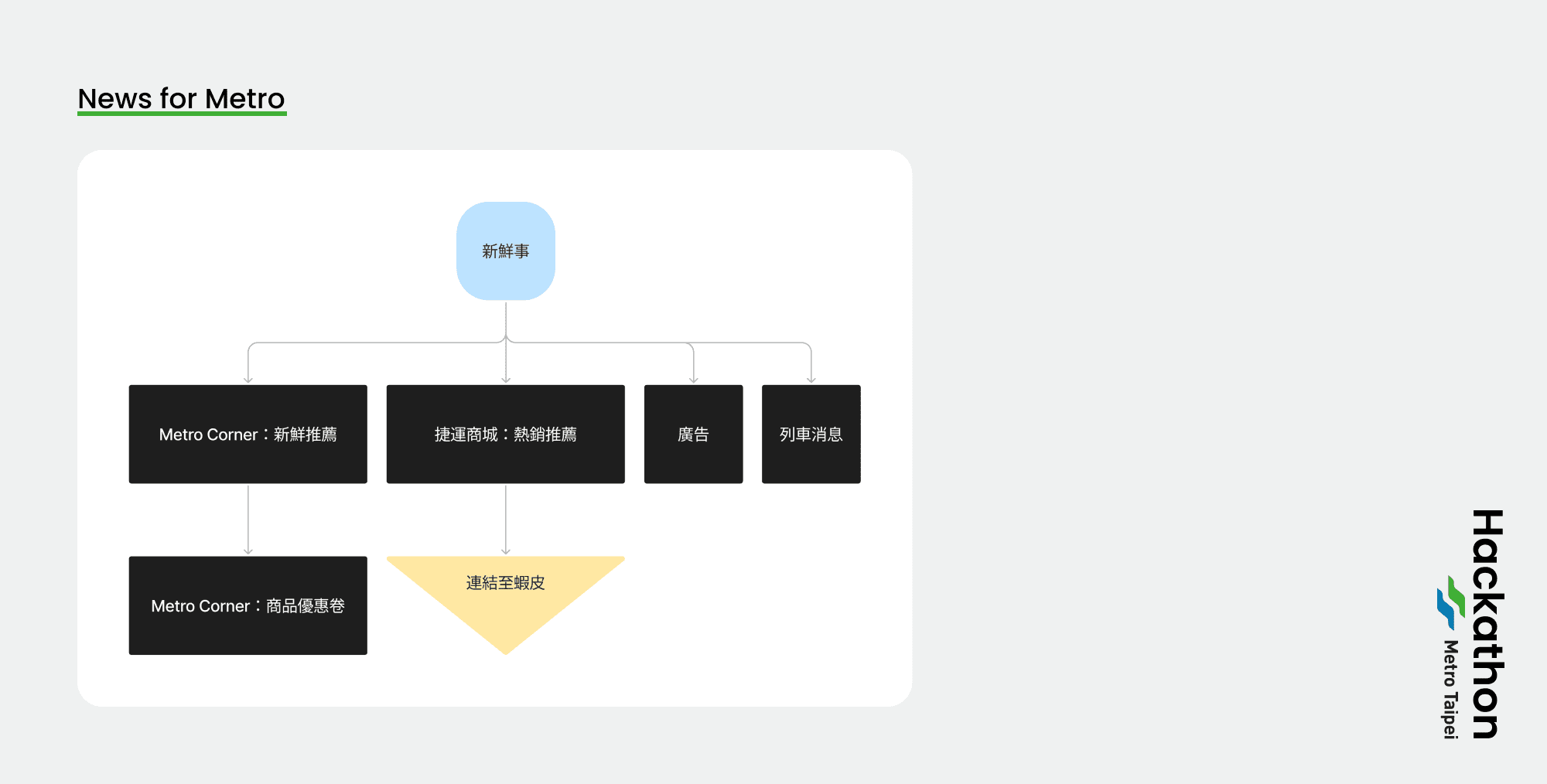
重新設計後,首頁留下列車到站時刻、捷運關聯事業,並新增即時天氣資訊以對應通勤族的需求。將最核心的搭車改由整頁「向右滑」進入,減少進入的流程。原有的線上商城/ 廣告由於成效不佳,改由「新鮮事」取代,提高內容質量。
Home Page Refine
重新設計後,首頁留下列車到站時刻、捷運關聯事業,並新增即時天氣資訊以對應通勤族的需求。將最核心的搭車改由整頁「向右滑」進入,減少進入的流程。原有的線上商城/ 廣告由於成效不佳,改由「新鮮事」取代,提高內容質量。
After the redesign, the homepage leaves the train arrival time, MRT related business, and adds real-time weather information to meet the needs of commuters. The core function of ‘Ride’ has been changed to ‘Swipe Right’ on the whole page to reduce the flow of entry. The original online shopping mall/advertisement is replaced by ‘What's New’ to improve the quality of the content due to its poor performance.
After the redesign, the homepage leaves the train arrival time, MRT related business, and adds real-time weather information to meet the needs of commuters. The core function of ‘Ride’ has been changed to ‘Swipe Right’ on the whole page to reduce the flow of entry. The original online shopping mall/advertisement is replaced by ‘What's New’ to improve the quality of the content due to its poor performance.
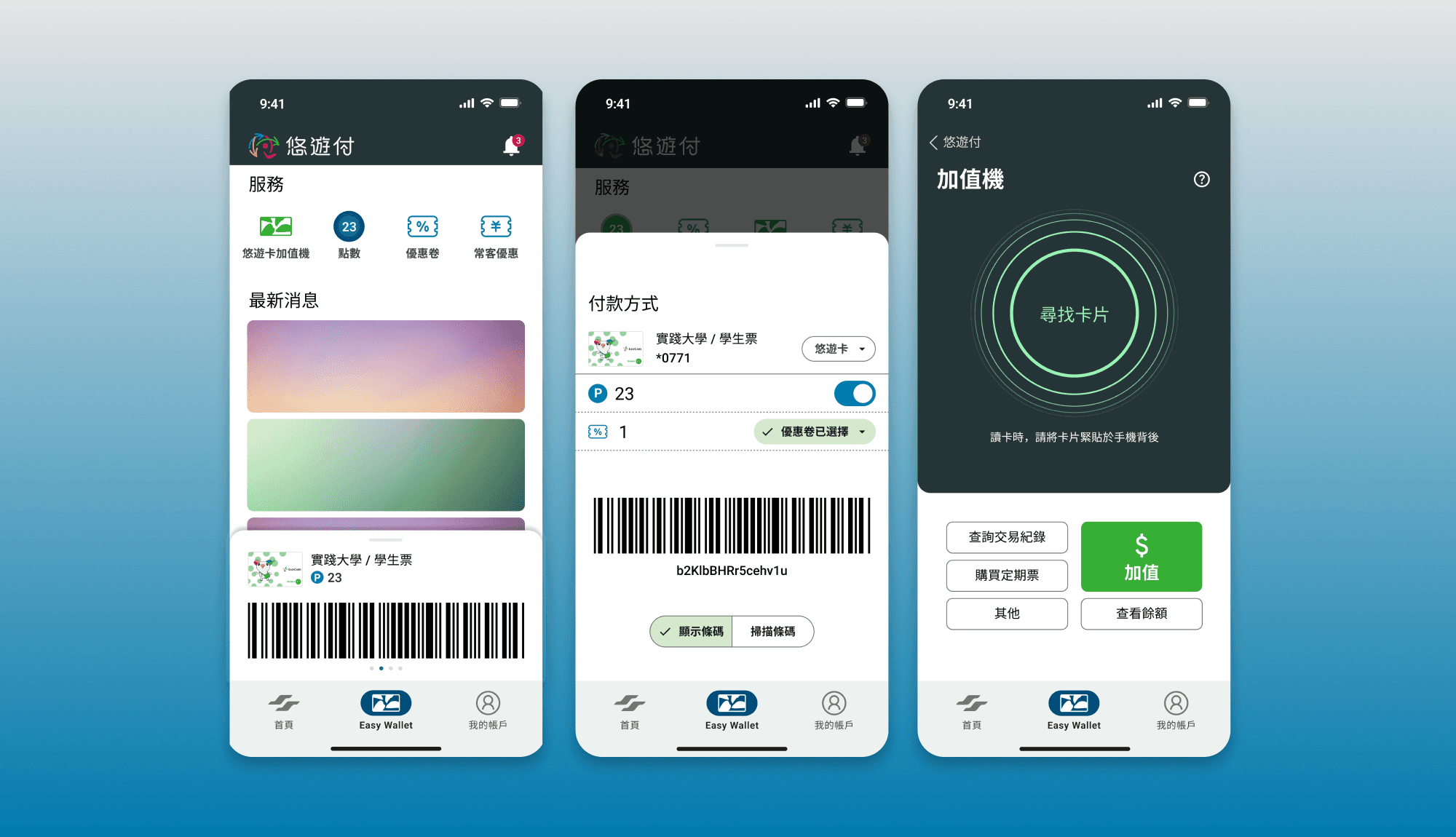
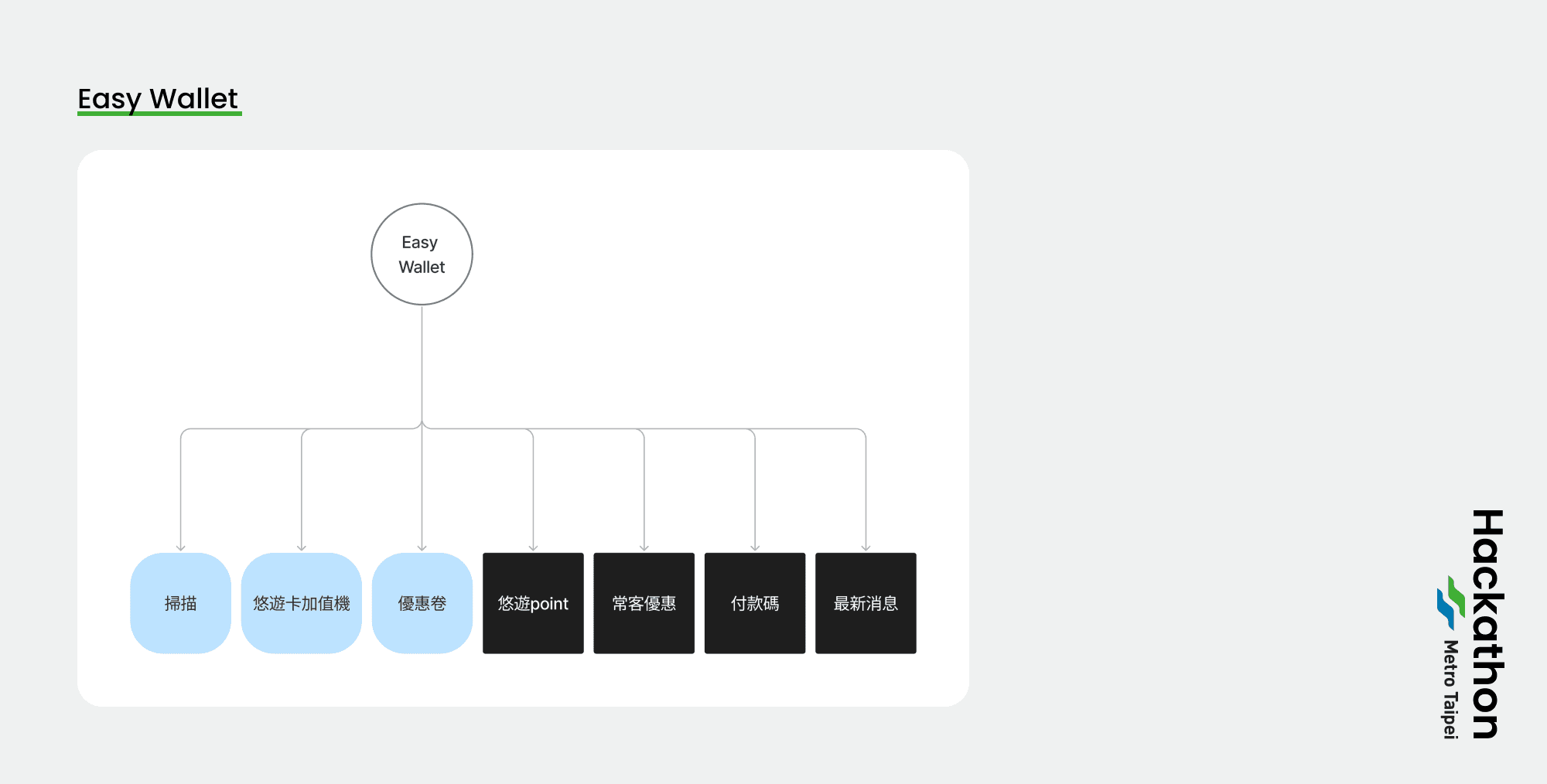
悠遊付 Easy Wallet
在台北捷運的未來規劃當中,行動支付本就是重要項目之一,考慮到業務整合的觀點,將常用的悠遊卡功能整合進 App 當中,使用者可以直觀檢視捷運乘車優惠。
同時,將 Metro Corner 商業內容顯示於該頁面當中,保留優惠卷功能之餘推廣 Metro Corner 品牌內容,達到使用者與品牌方的利益平衡。
悠遊付 Easy Wallet
在台北捷運的未來規劃當中,行動支付本就是重要項目之一,考慮到業務整合的觀點,將常用的悠遊卡功能整合進 App 當中,使用者可以直觀檢視捷運乘車優惠。
同時,將 Metro Corner 商業內容顯示於該頁面當中,保留優惠卷功能之餘推廣 Metro Corner 品牌內容,達到使用者與品牌方的利益平衡。
In the future planning of the Taipei Metro, mobile payment is one of the most important items. Considering the point of view of business integration, the frequently-used EasyCard function is integrated into the App, so that users can view ”Metro Corner” discounts in a straightforward manner.
At the same time, “Metro Corner” business content is displayed on the page, retaining the coupon function while promoting “Metro Corner“ brand content, achieving a balance between the interests of users and the brand.
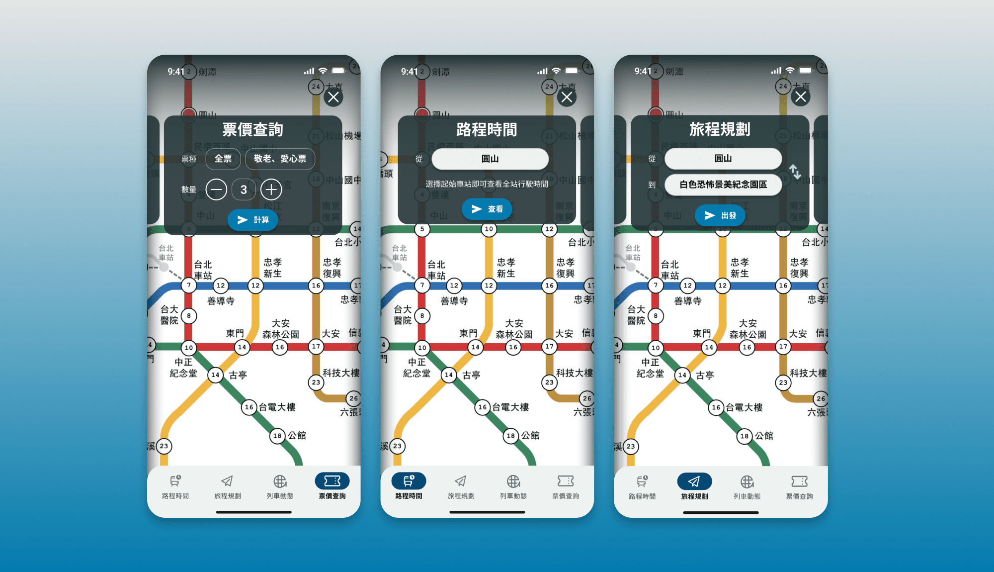
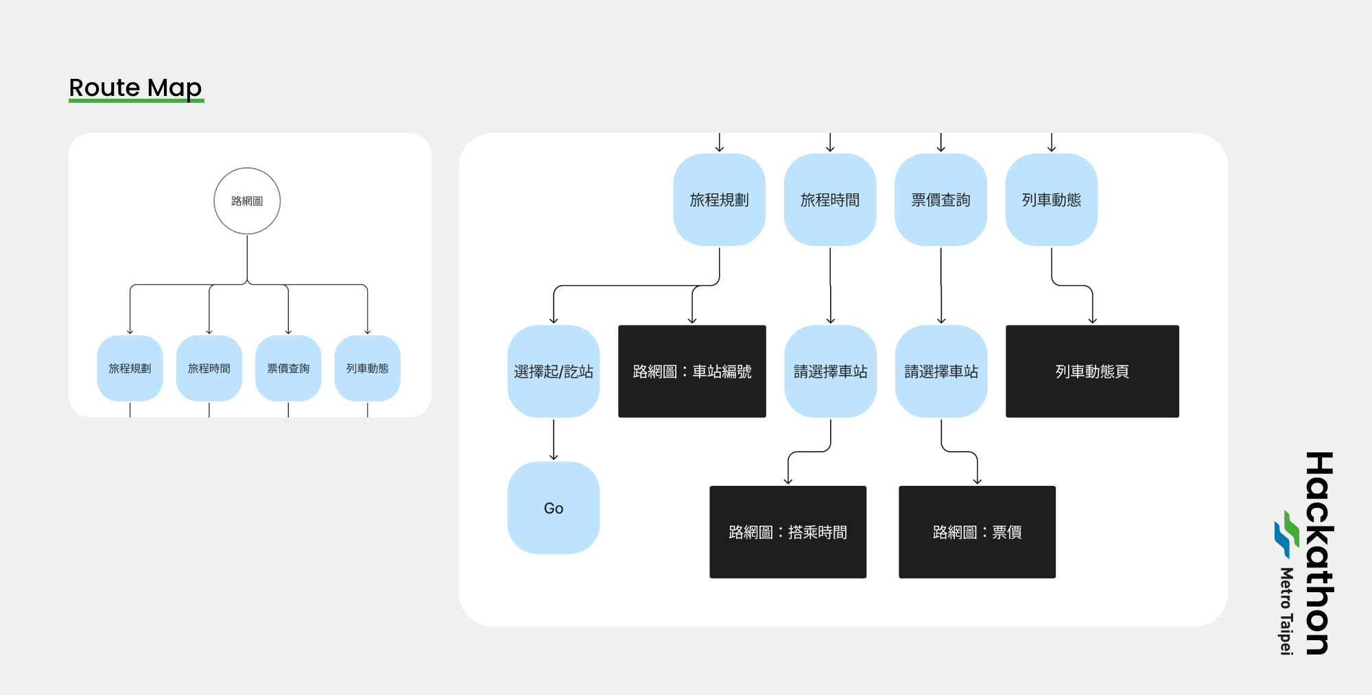
路網圖 Route Map
整理資訊架構後,我選擇將搭車最相關的四個功能(旅程規劃、旅程時間、票價查詢、列車動態)整合進「路網圖」子頁中,將票價查詢功能加入多人票價計算。
路網圖 Route Map
整理資訊架構後,我選擇將搭車最相關的四個功能(旅程規劃、旅程時間、票價查詢、列車動態)整合進「路網圖」子頁中,將票價查詢功能加入多人票價計算。
After organizing the information structure, I chose to integrate the four most relevant functions (journey planning, journey time, fare inquiry, and train status) into the “Roadmap” subpage, and added the fare inquiry function to the multi-person fare calculation.
After organizing the information structure, I chose to integrate the four most relevant functions (journey planning, journey time, fare inquiry, and train status) into the “Roadmap” subpage, and added the fare inquiry function to the multi-person fare calculation.
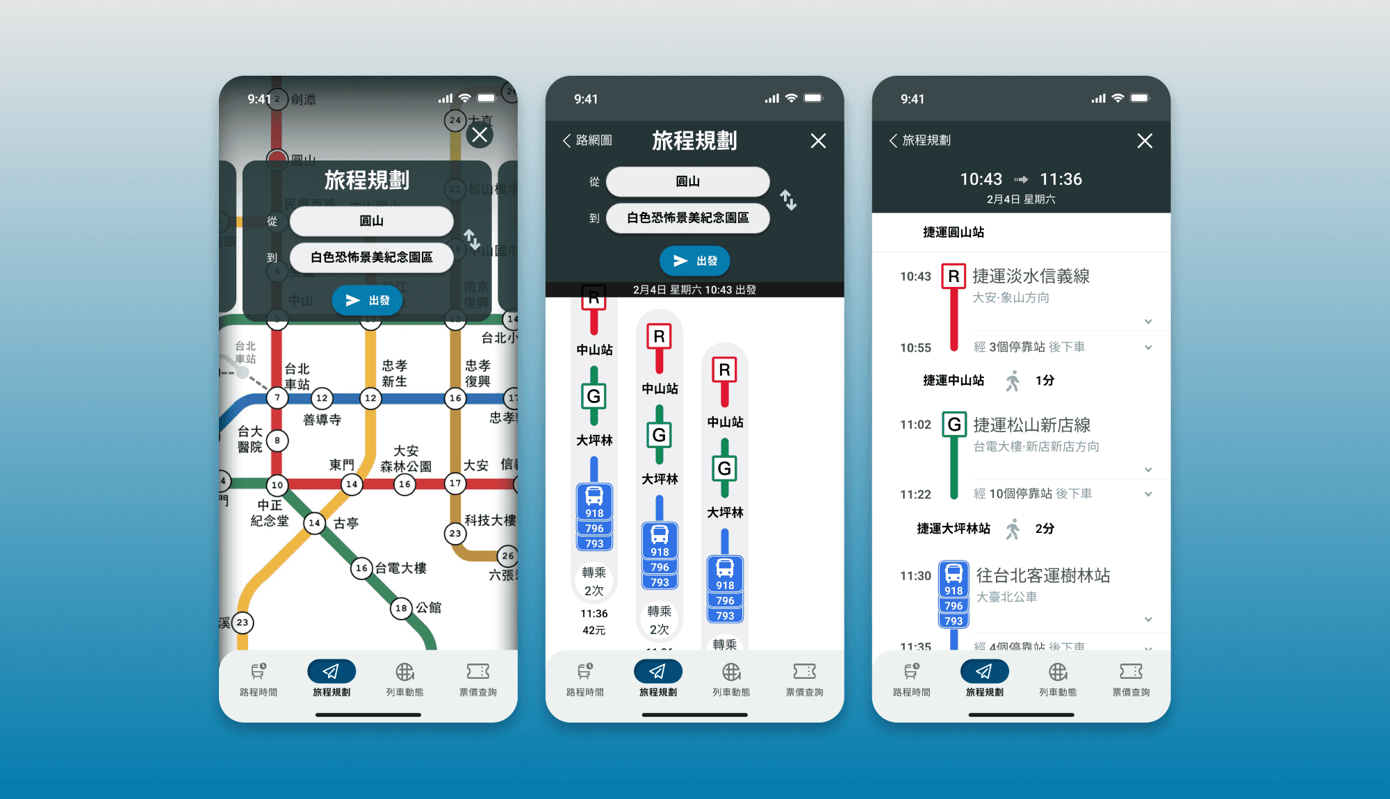
旅程規劃 Planning
在原有的旅程規劃中,資訊顯示過於密集,字級顯示上也不夠清晰,在這裏以「時間帶」的排版重新呈現。除了捷運本身的交通網,更整合大眾運輸資源,提供多樣化的旅程規劃,點進時間帶後,更可以查看行走路線的引導。
旅程規劃 Planning
在原有的旅程規劃中,資訊顯示過於密集,字級顯示上也不夠清晰,在這裏以「時間帶」的排版重新呈現。除了捷運本身的交通網,更整合大眾運輸資源,提供多樣化的旅程規劃,點進時間帶後,更可以查看行走路線的引導。
In the original journey planner, the information display is too dense and the font level is not clear enough, so it is re-presented in the layout of “time zone”. In addition to the MRT's own transportation network, it also integrates public transportation resources to provide a variety of trip planning, and after clicking on the time zone, you can even view the guidance of the route.
In the original journey planner, the information display is too dense and the font level is not clear enough, so it is re-presented in the layout of “time zone”. In addition to the MRT's own transportation network, it also integrates public transportation resources to provide a variety of trip planning, and after clicking on the time zone, you can even view the guidance of the route.
Reflection —
這是我跟大學同學合作的 side project,在起初,是對數位產品領域的設計挑戰,但在執行專案的過程當中,感受到好的資訊架構 & 體驗造就的是改善生活體驗;當商業思維與使用者體驗有所衝突時,運用設計思維與邏輯思考來找到平橫點,是這個專案給我的體悟。
這是我跟大學同學合作的 side project,在起初,是對數位產品領域的設計挑戰,但在執行專案的過程當中,感受到好的資訊架構 & 體驗造就的是改善生活體驗;當商業思維與使用者體驗有所衝突時,運用設計思維與邏輯思考來找到平橫點,是這個專案給我的體悟。
This is a side project that I worked on with my university classmates. At first, it was a design challenge in the digital product field, but in the process of executing the project, I realized that a good information architecture & experience can improve the life experience; when there is a conflict between business thinking and user experience, using design thinking and logic to find a balance point is the realization that this project has given me.
This is a side project that I worked on with my university classmates. At first, it was a design challenge in the digital product field, but in the process of executing the project, I realized that a good information architecture & experience can improve the life experience; when there is a conflict between business thinking and user experience, using design thinking and logic to find a balance point is the realization that this project has given me.